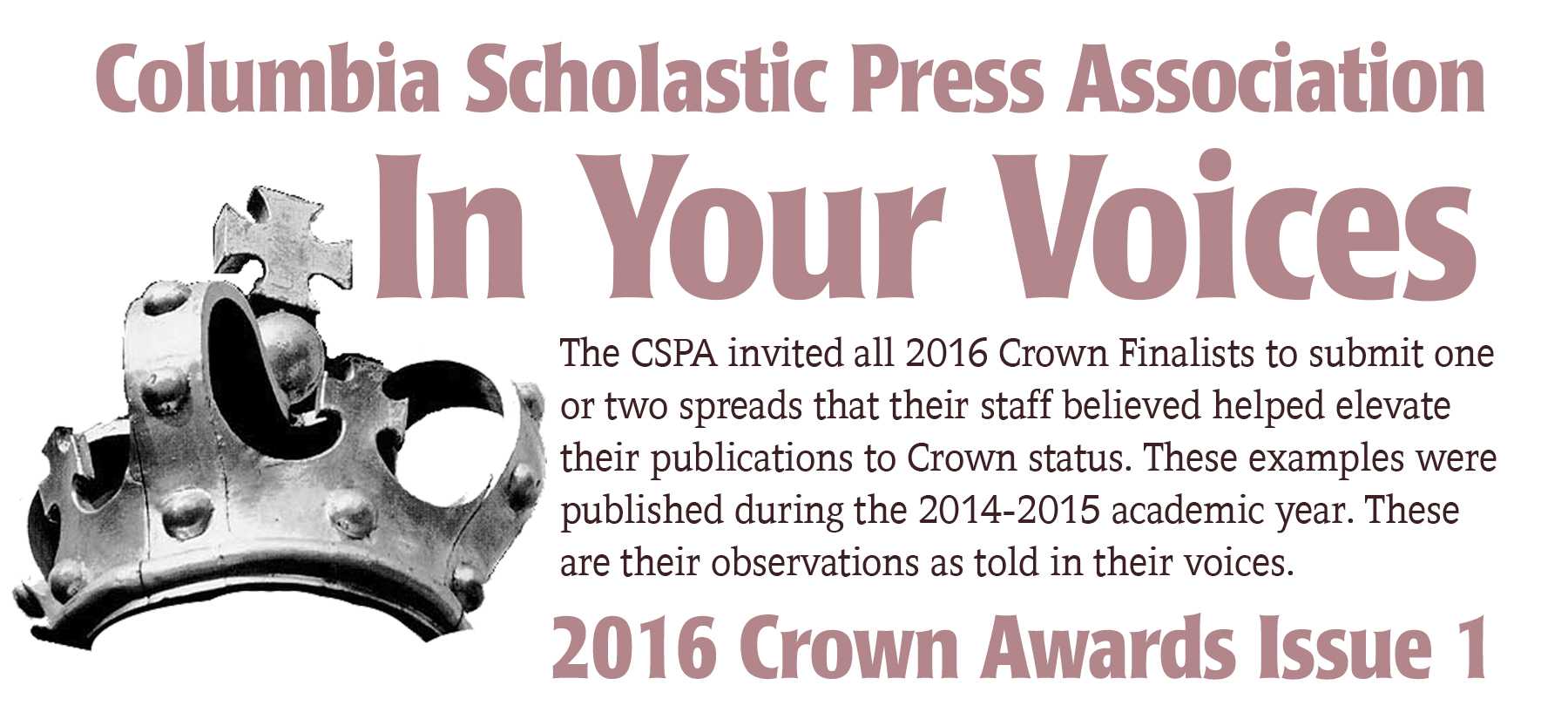
In Your Voices 2016 issue 1
March 30, 2016
Ampersand Magazine, Webster University, Saint Louis, MO;
This is from our Spring 2015 issue, pages 10-11
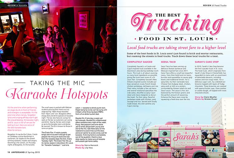
“I feel these pages really show a clean, consistent layout as well as a creative use of typography. The students were creative and clever with the headline treatments. They pulled the color from the images which helps it have a cohesive look.”
Spring 2015 pages 38-39
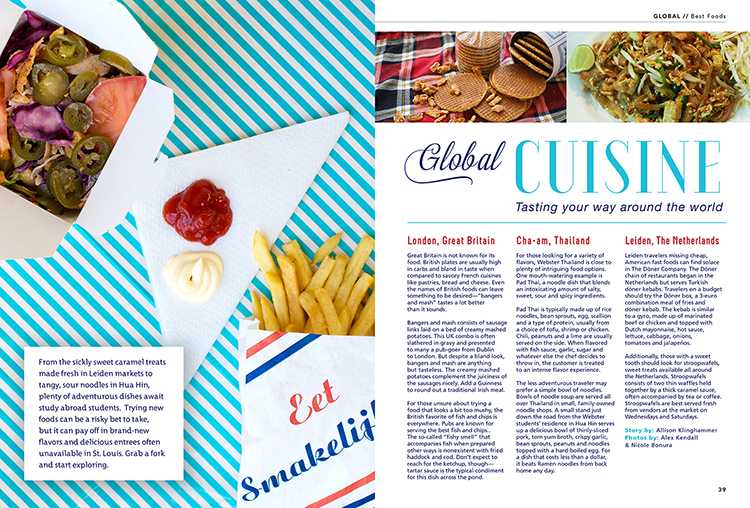
“These pages carry out our grid, creative use of typography and beautiful photography. We have recently included a “Global” section to the magazine since the university has campuses around the world. We work with students at these campuses to shoot the photos and write the copy.”
____________________________________________________
Blutopia, Gaston Day School, Gastonia, NC;
Lines about “Ruby” on pages 22-23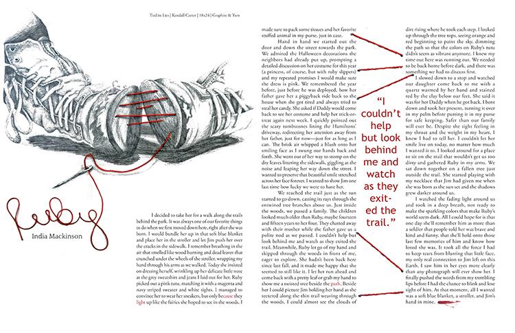
“The editors integrated the spot color from the laces in the shoes to create a title with movement and a cohesive connection to the image. The starkness of the ink drawing contrasts with the innocence of the shoes and provides a strong thematic connection to the written piece.”
Lines about “Crackerjack College” on pages 18-19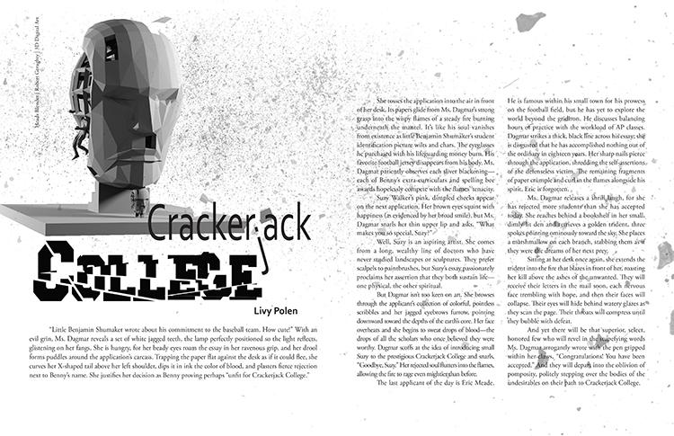
“The editors used Photoshop to incorporate texture that mimics the graphic quality of the digital artwork. They continued the theme by creating tension in the headline to tie in the thematic elements of the text.”
____________________________________________________
Calumet, Arapahoe High School, Centennial, CO;
Pg. 2-3 Opening:
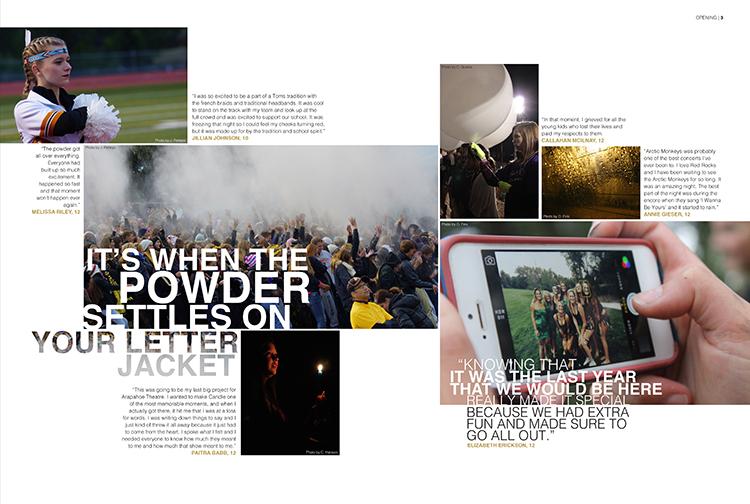
“This spread, one of three opening spreads, demonstrates the staff’s skill in reporting, photography, and graphic design. The artistic photos paired with meaningful quotes effectively portray the fleeting moments of adolescence so that they may be remembered years down the road. The theme “What We Hold On To” is translated stylistically by a unique photo package that “holds” each quote either alongside or within the corresponding photo.”
Pg. 96-97 Cross Country:
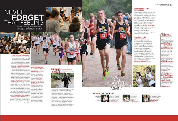
“This spread shows the staff’s abilities in sports photography, journalistic writing, and modular coverage. Both the copy block and captions follow AP Style while maintaining thematic voice. Additionally, extensive modular coverage displays skill in interviewing and in devising interesting, unique ways of covering the year’s events.”
____________________________________________________
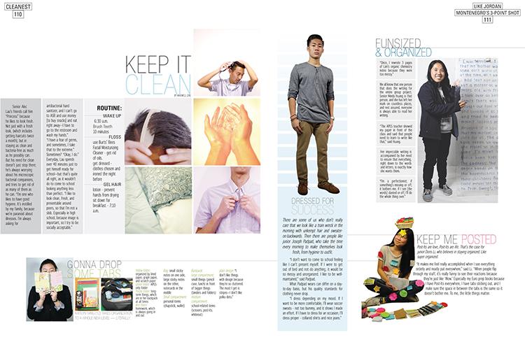
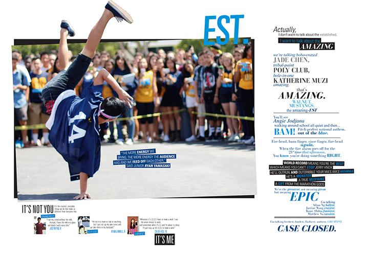
Cayuse, Walnut High School, Walnut, CA;
Pages 4-5:
“This is the second half of the opening. It is the first time students are introduced to how -EST, the superlative, exists at school. By starting the all coverage device module from this page, the editors were able to link each student’s unique (-EST) quality to each page.”
Pages 110-111:
“The CLEANEST page for the -EST superlative magazine shows how the concept of something extreme can be applied to any aspect of student life. It is not as flashy or colorful, but it is just as -EST as the other pages. This page shows how a lot of thought needs to go into creating something simple and clean.”
____________________________________________________
Changing Perspectives, Delaware Valley Regional High School, Frenchtown, NJ;
Page 28:
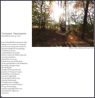
“Exemplifying the staff’s efforts to link the art and writing thematically, this spread utilizes the image in the photograph and makes literal the metaphor in the poem through the pairing.”
Pages 66-67:
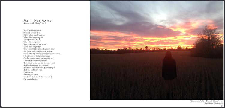
“As the final pages of the magazine, the editors believe that this spread represents what we strove for throughout the book: a thematic cohesion between the art and the writing, creative layout design while maintaining clarity and focus on the work, and an accurate reflection of the “Weathered” theme. As a conclusion piece, this poem and photograph seem to open the door for the possibilities beyond the problems or “storms” of the present.”
###